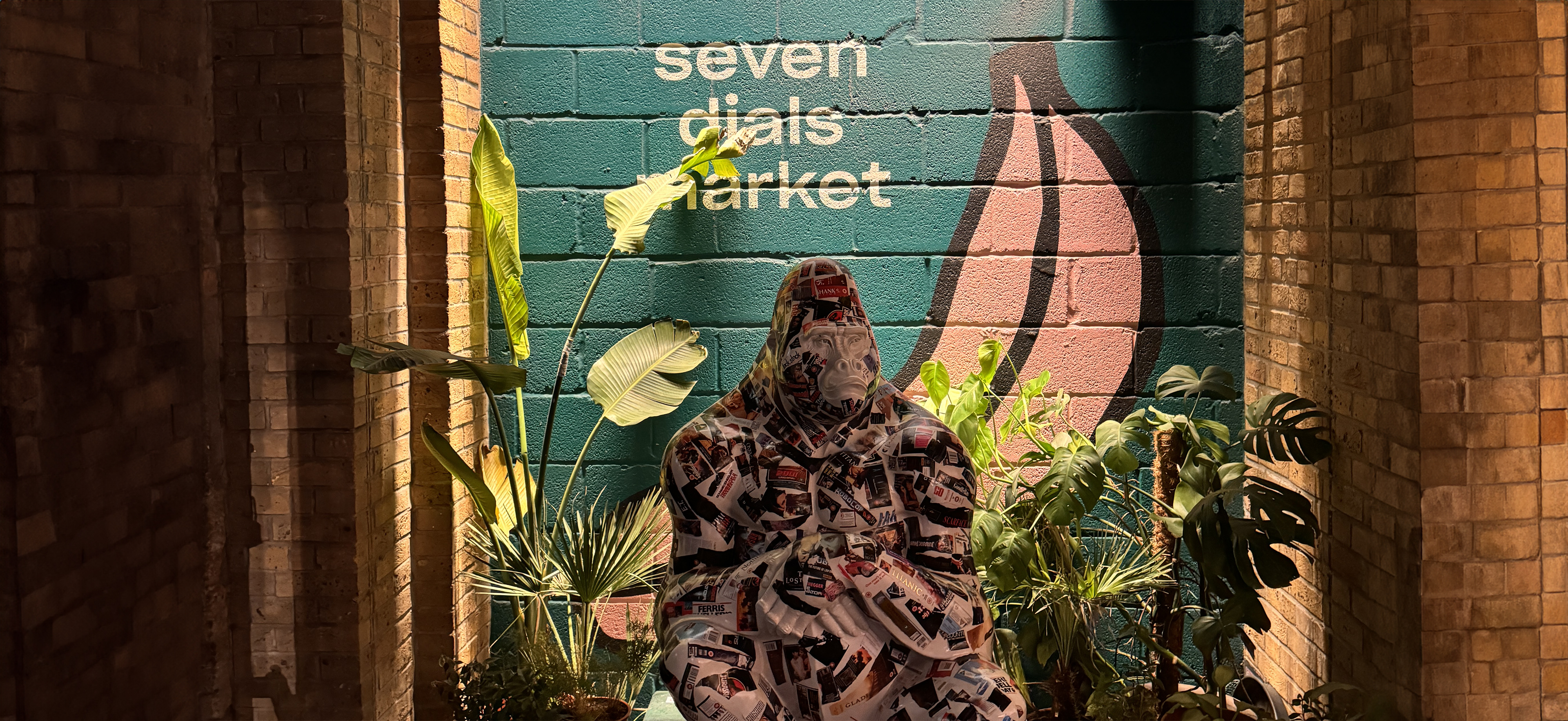
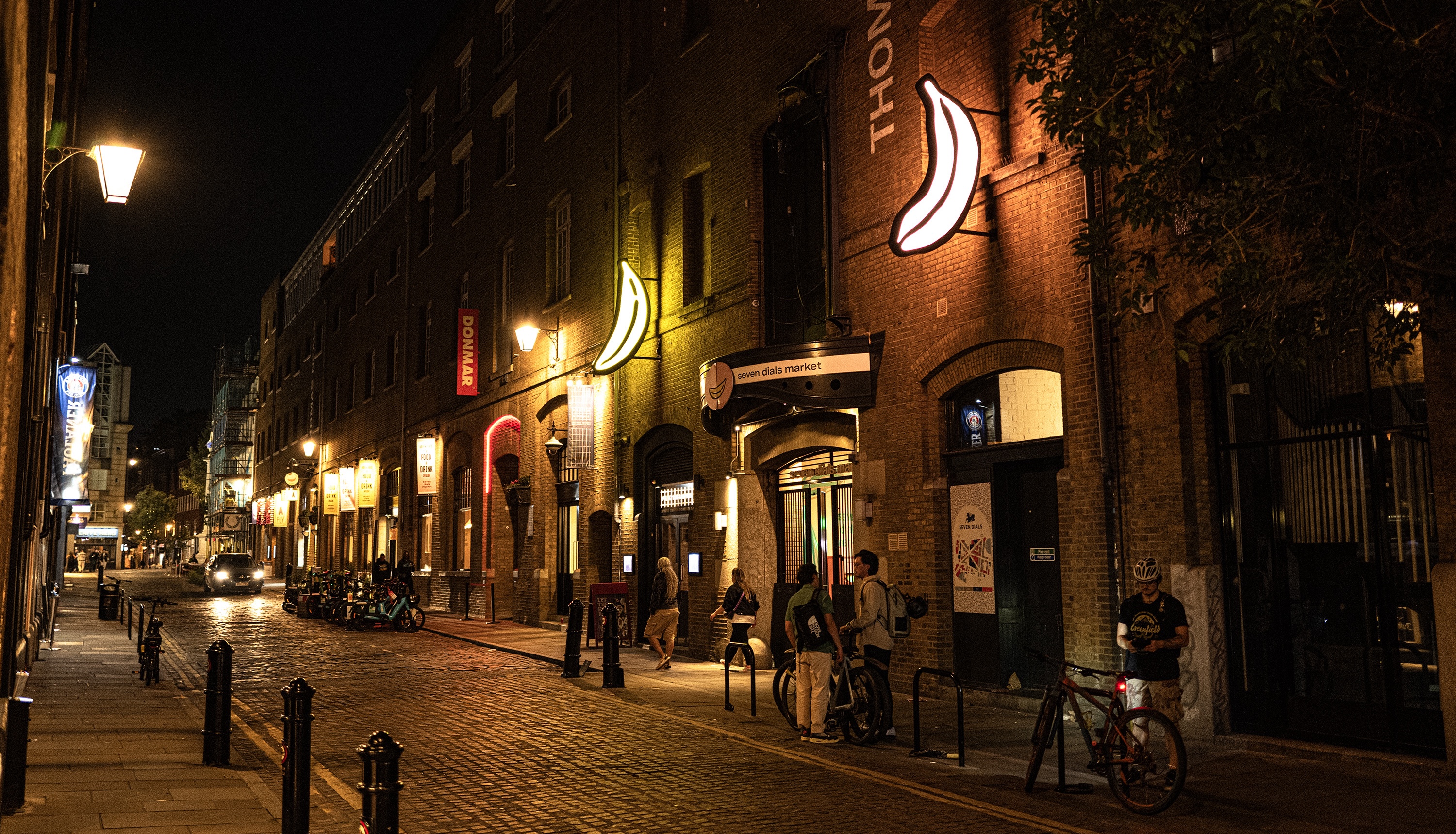
Investigation Site: Seven Dials Market
Location: London, WC2H 9LD
Site type: Food Market
Street Food from all around the world, met at the sharing tables at Seven Dials Market!
DIFFERENT FOCUSES
ACROSS THE PROJECT
First Week
- People (Consumer)
- Who are they? / Why are they coming? / Where are they coming from?
- What are they doing on the site? / What are their Behaviours?
- Their footpaths/traces
Second Week
- Traders (Restaurants)
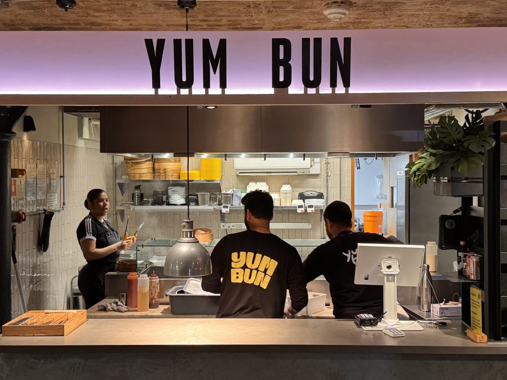
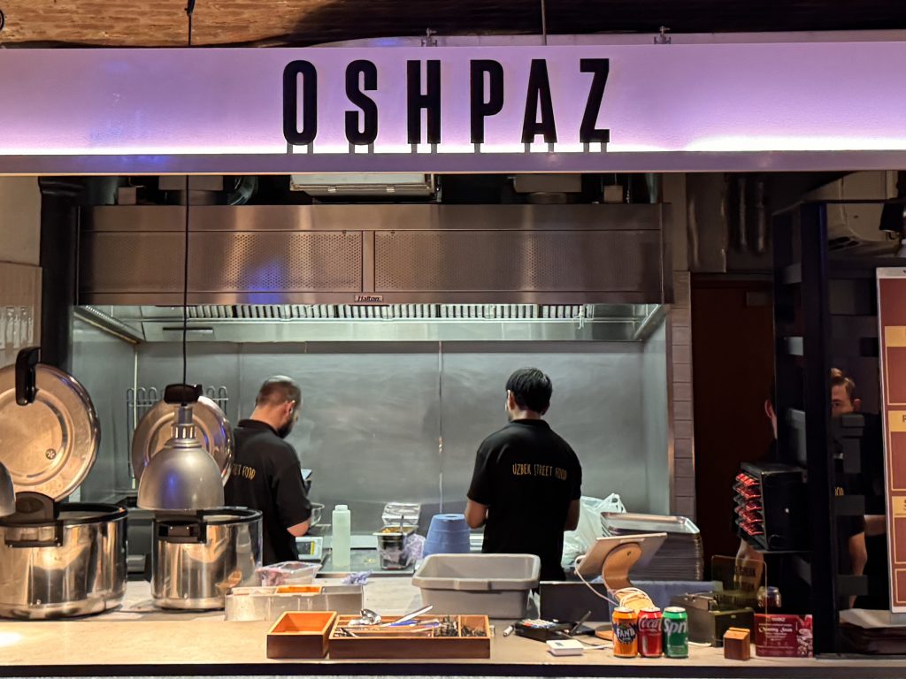
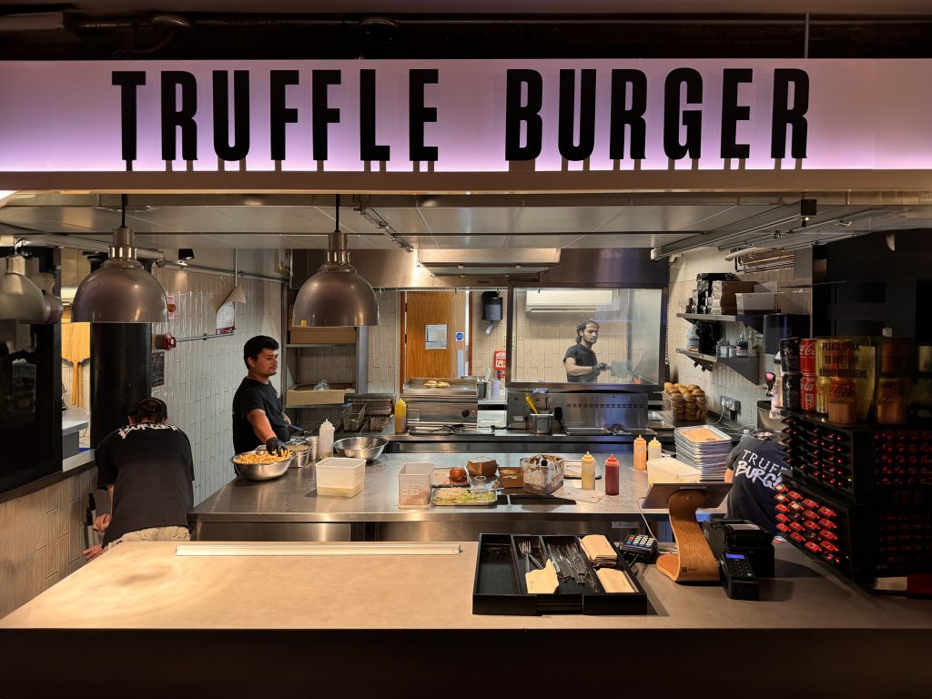
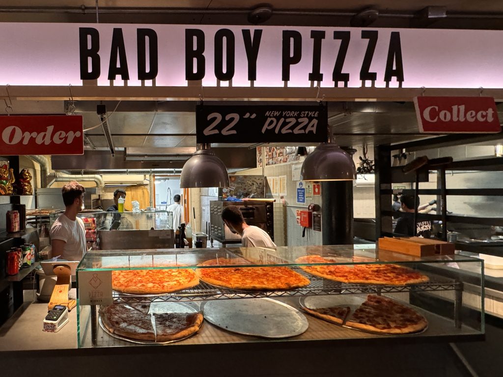
- Their Kitchens
- Their special foods
- Tastes of their foods
- The smells that they produce
Third (Final) Week
- Cuisines
- Cultures behind it
- Their menus
- Presentation of the foods
- Role of graphic design
- Relations / Connections between all Investigations
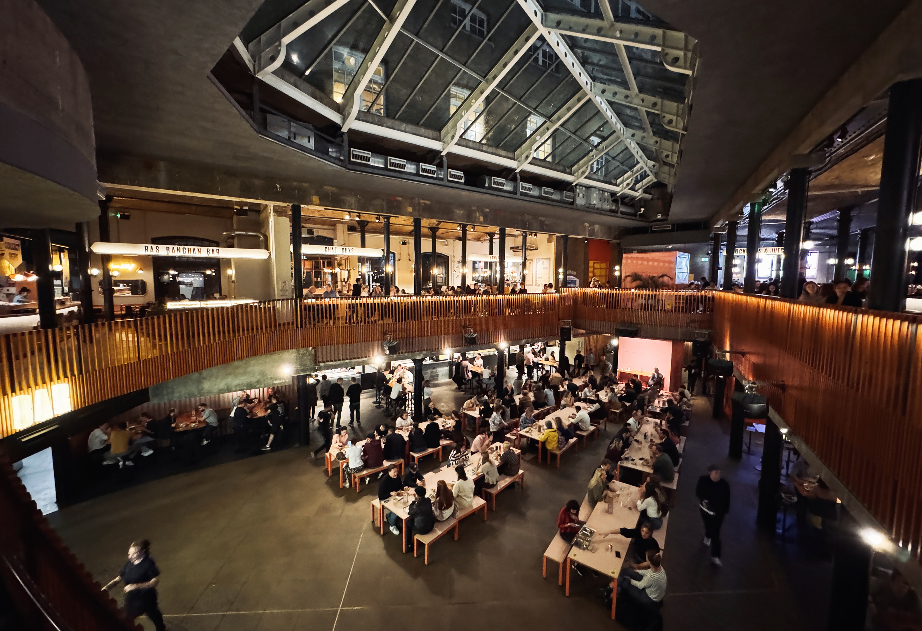
Investigation Area:
Lower Ground Floor
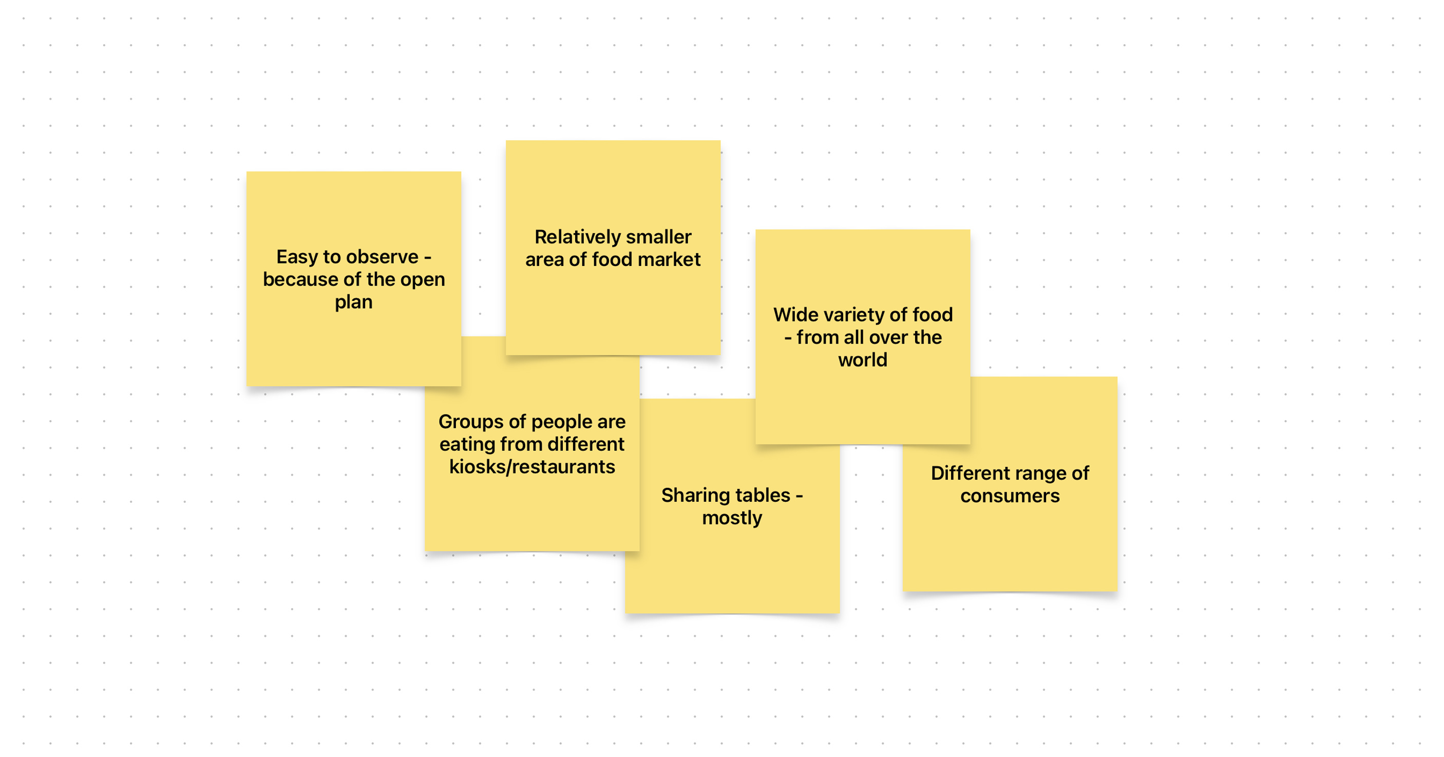
- People coming from: Work, Shopping, School
- People comes for: Eat, Drink, Meet, and Date
- People came as: Groups of friends, Co-workers, Couples, and Students
- Kinds of food: Street food, Asian, Mexican, Italian, Burger, Pizza, and Mediterranean
People’s Behaviours
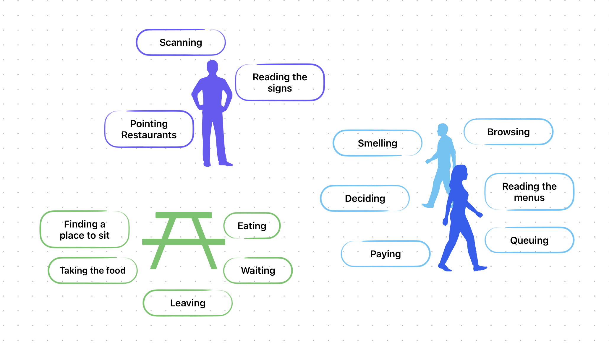
Sketch of the Venue
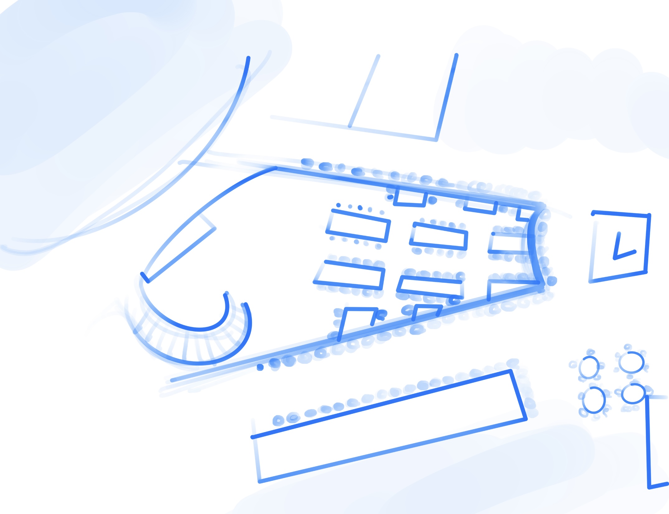
Traces of the People
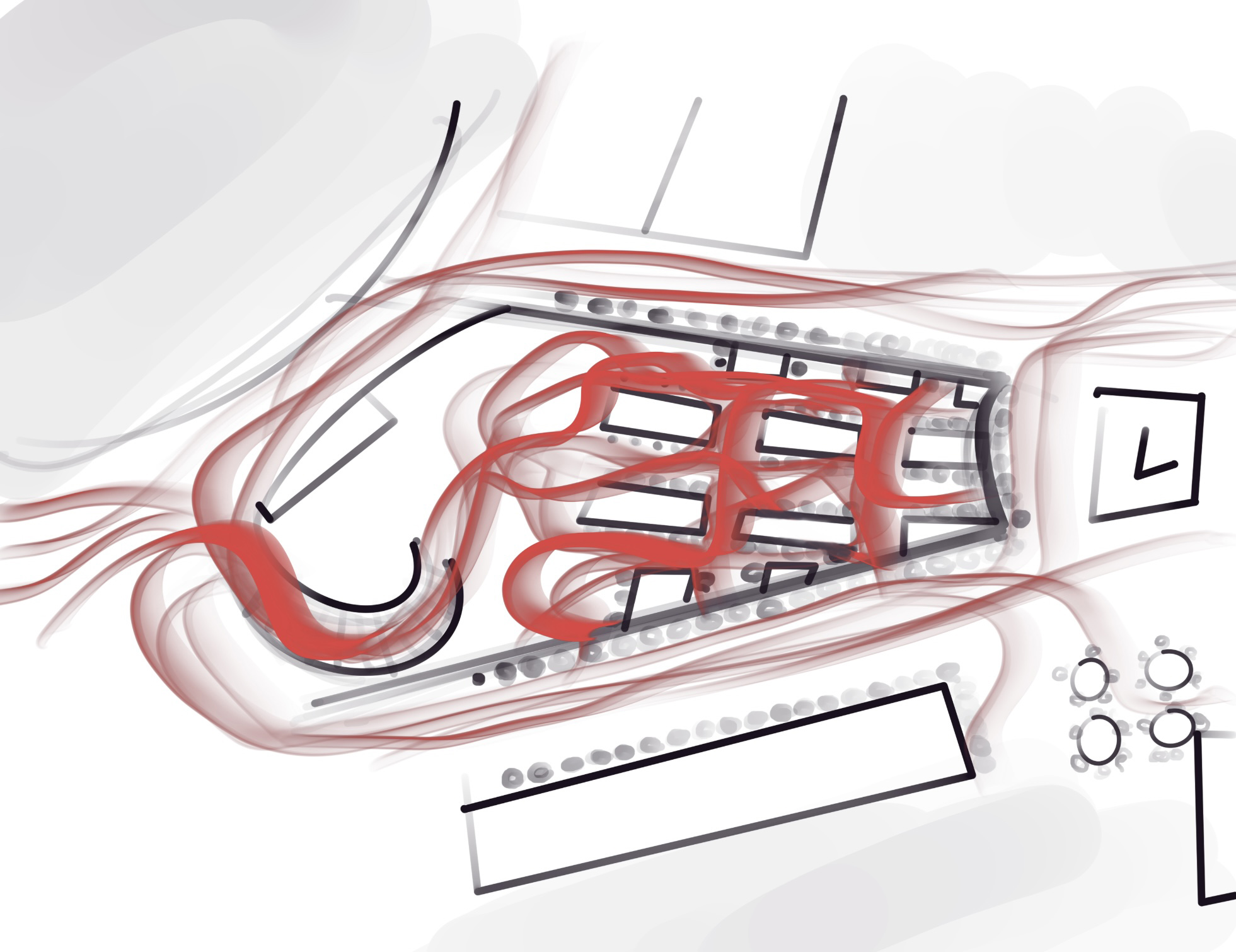
Kitchens
Investigation on Kitchens
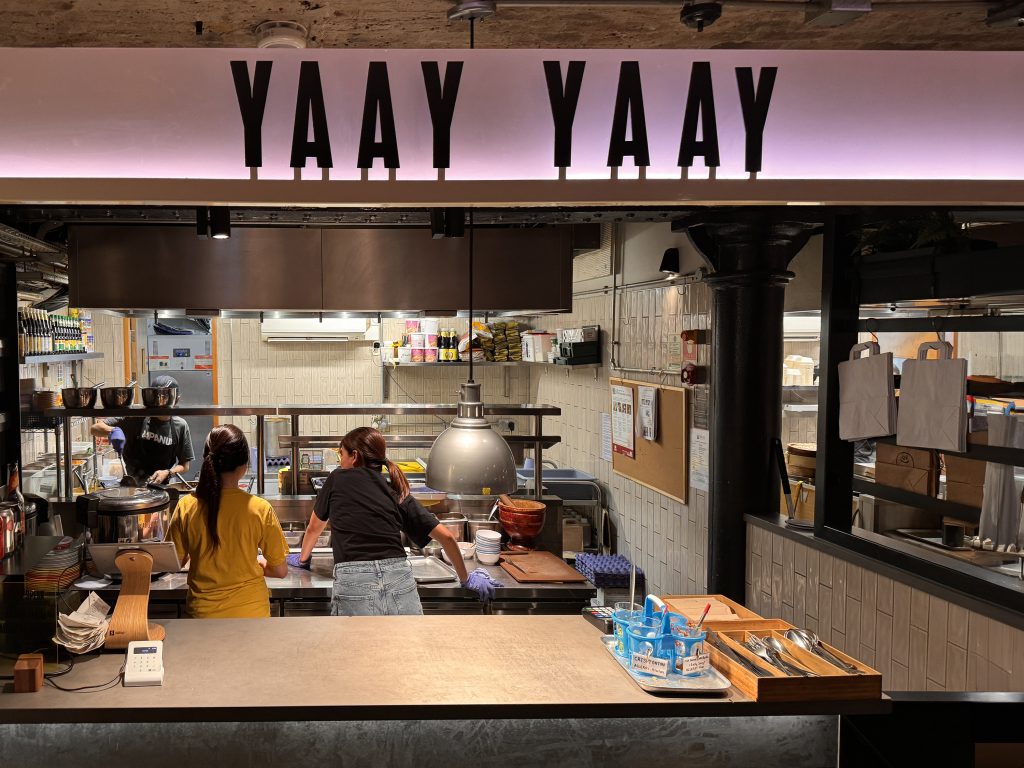
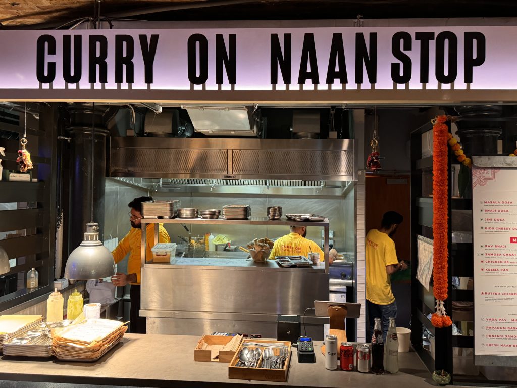
- They all have the same sized facade but the layouts and depth of their kitchens depend on their preparation process and their needs.
- They had to use the same lettering to indicate their restaurants. They weren’t allowed to use their logos on the facade. That’s why we can’t see the pros and cons or benefits and harms of using graphic design.
Menus
Questioning the Role of Graphic Design
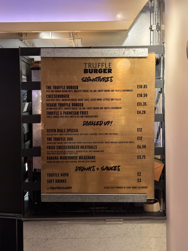
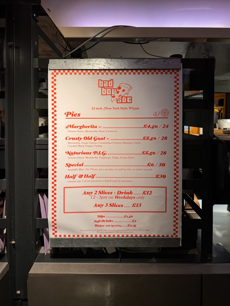
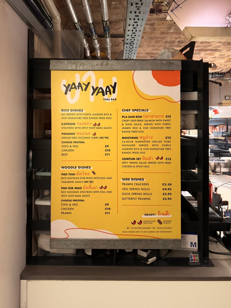
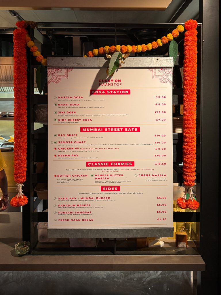
Through the Menus
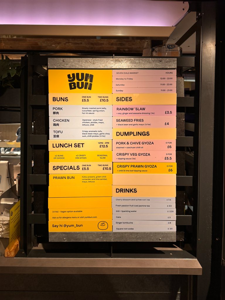
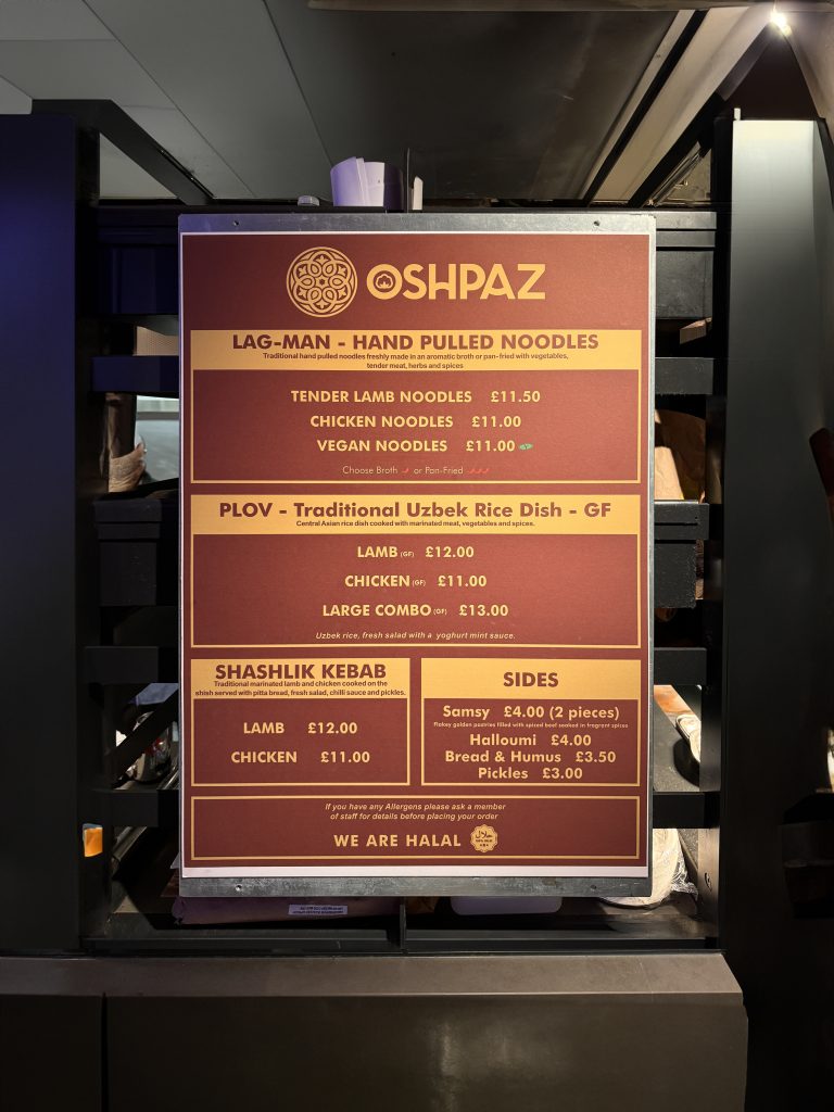
- They should give some clues and ideas about its cuisine and products.
- Colours, patterns and typefaces are significantly important to reflect the characteristics of the restaurant and the cultural history behind it.
- In terms of overall design of the menus are consistent.
- They are all in the same size.
- The Yum Bun and the Yaay Yaay’s menus made a modern-looking menu with vibrant colours but Yaay Yaay used “egg” shaped illustrations just to point out that most of the Thai cuisine and their foods contain egg in a substantial level.
- Truffle Burger has chosen to go on a neutral wood, and the Bad Boy Pizza used a pretty common pizza box inspired pattern and decided to manifest their fast-food vibes. They both have decided to go with the classic style since they offer the most well-known products of the market.
- On the other hand, Oshpaz and the Naanstop used traditional colours and patterns to refer to their culture. Unlike others, Naanstop put additional decorations on top of the menu to support the menu and make it stand out among others.
Foods
Investigation of Presenting Foods
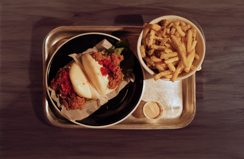
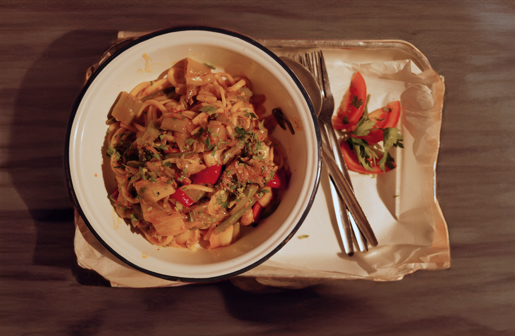
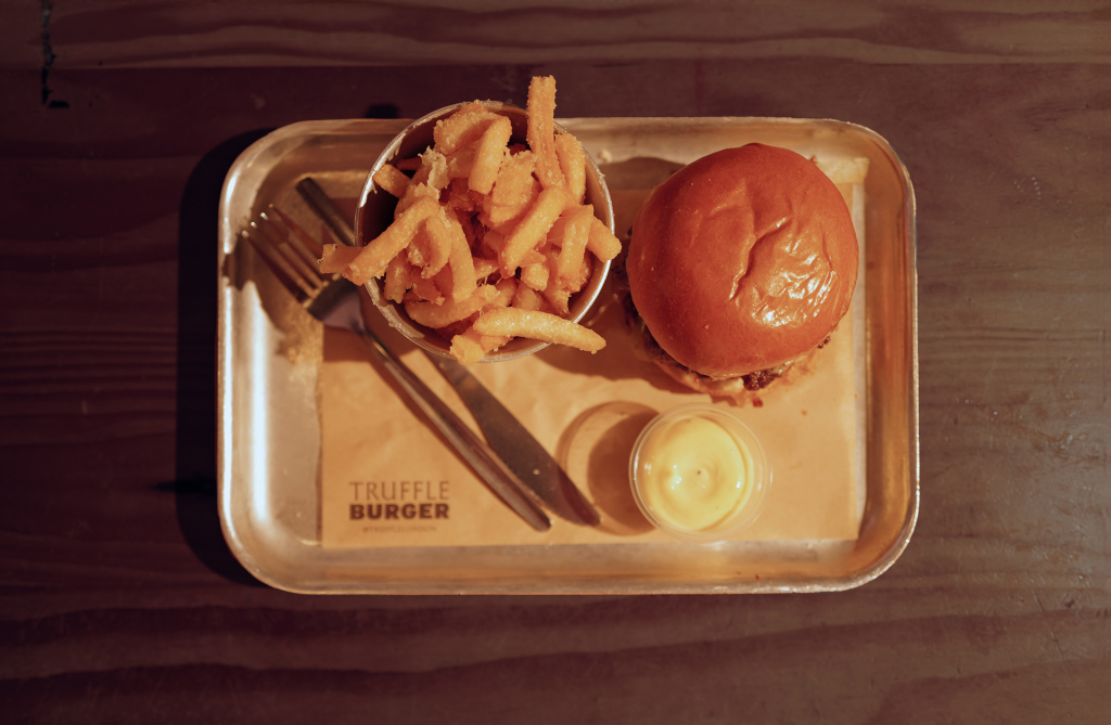
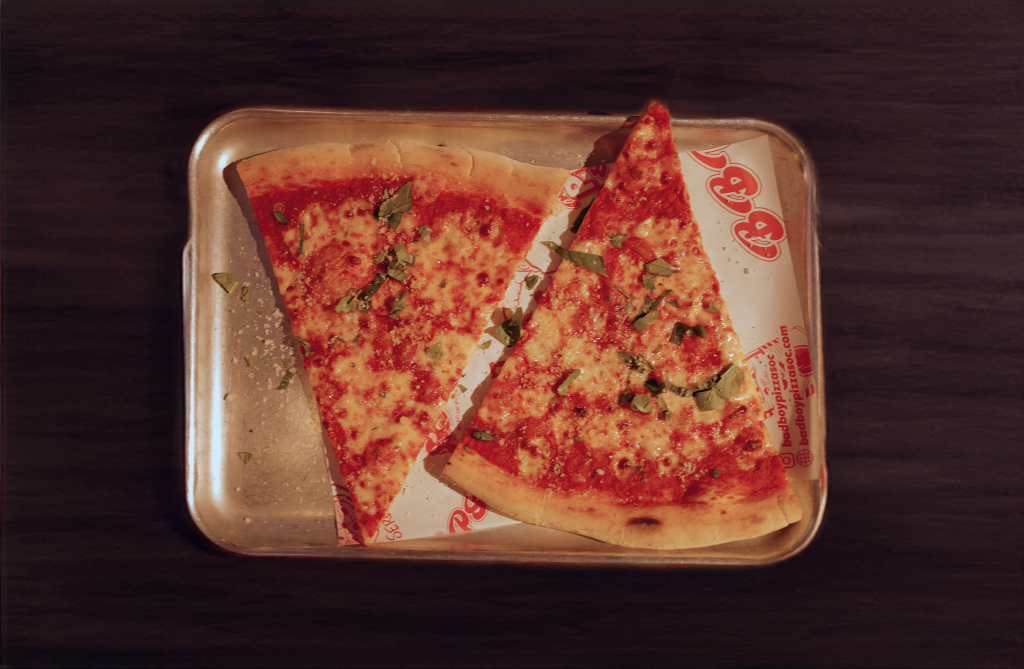
- They all served on similar-sized and shaped metal trays.
- The pizza and the bun weren’t served with the cutlery, indicating that these foods are more tent to be eaten by hand.
- The burger comes with a knife and fork, whereas the Noodle, Thai and Indian food is served with an additional spoon.
- The burger and pizza had no plates because they were one solid piece that wouldn’t fall apart over the tray.
- Indian food is served in a “table d’hote” tray, which offers separated parts to avoid mixing the foods which is unique among others.
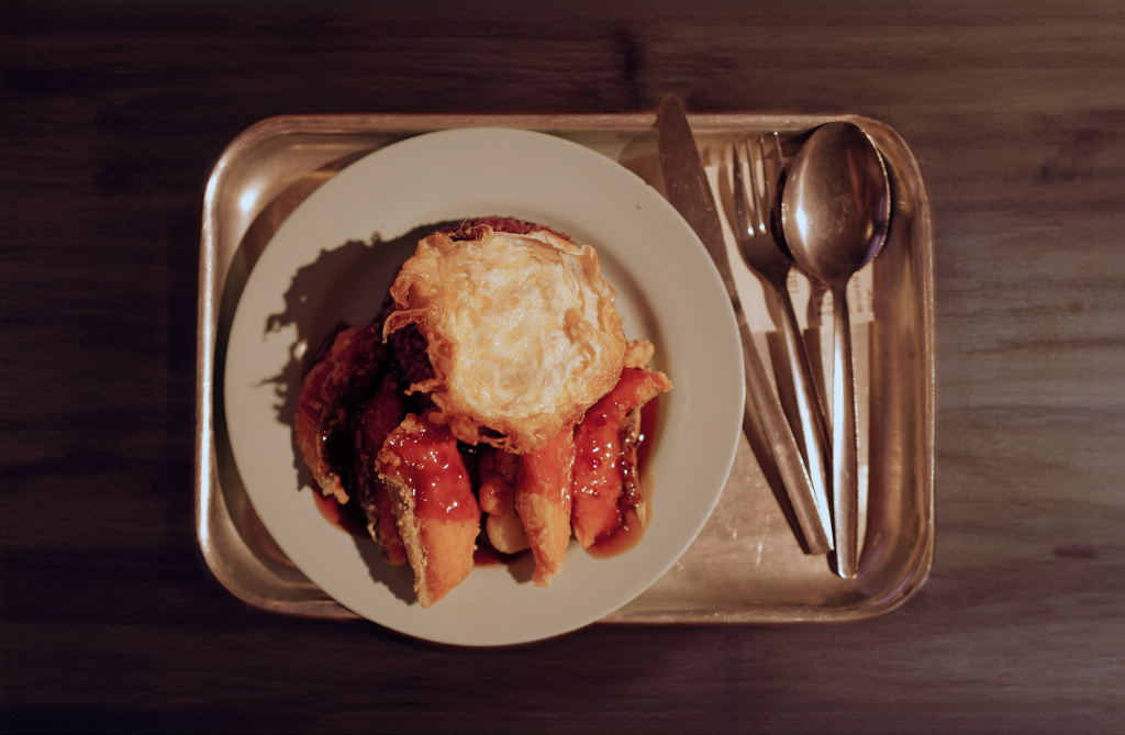
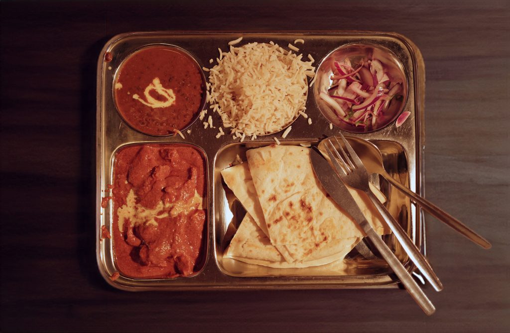
Food Notes
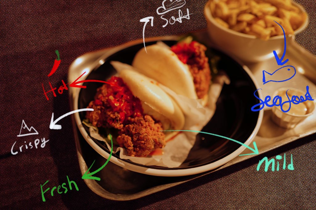
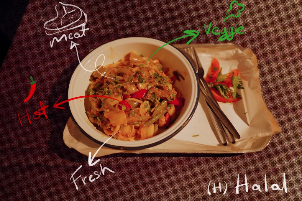
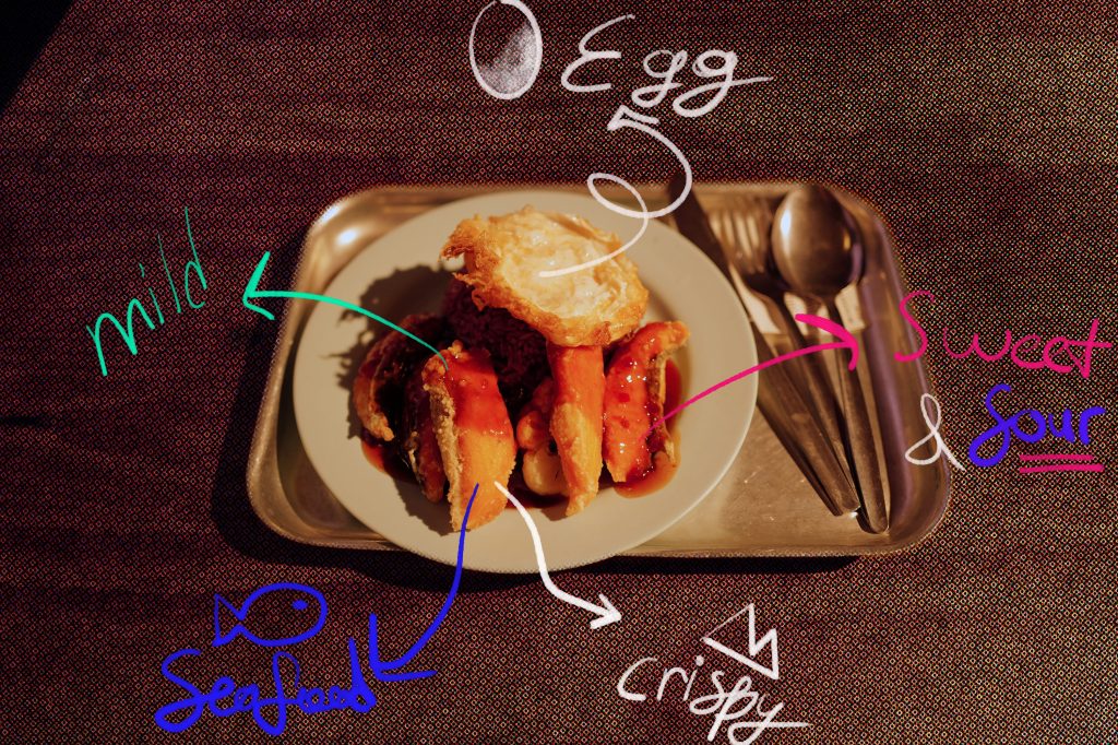
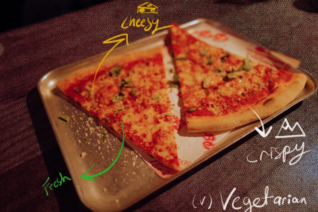
Taste Notes
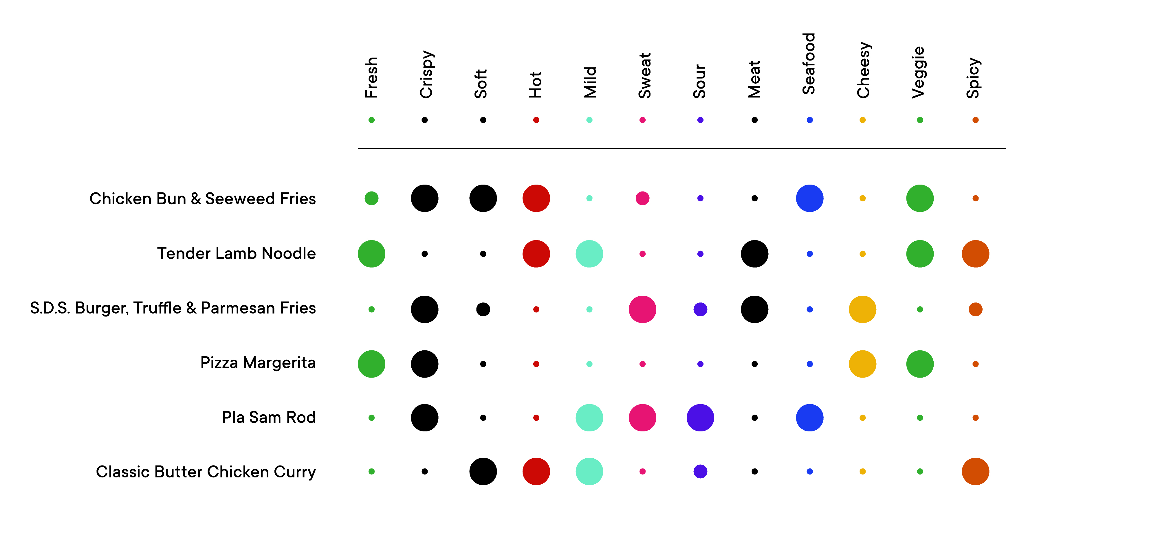
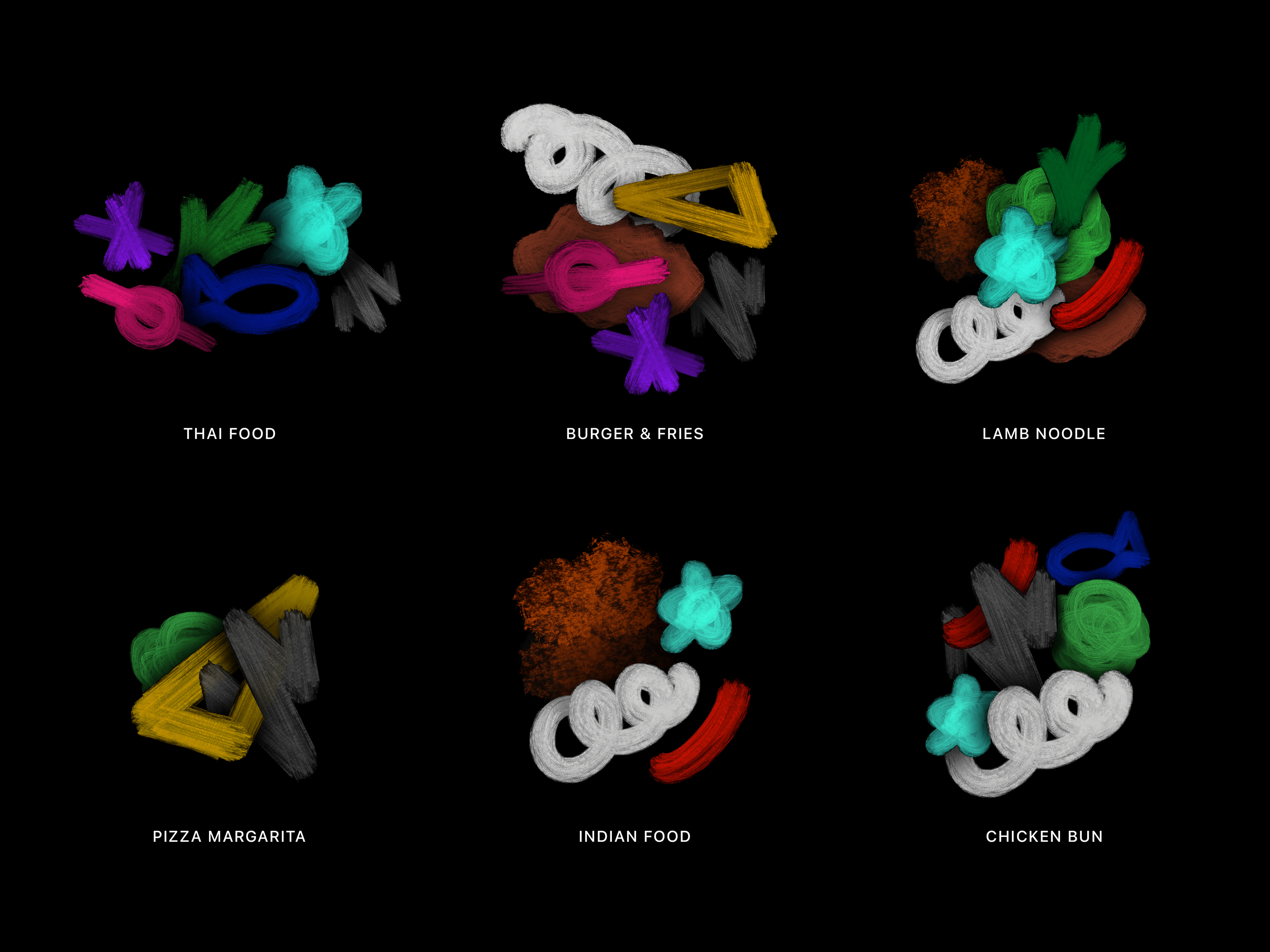
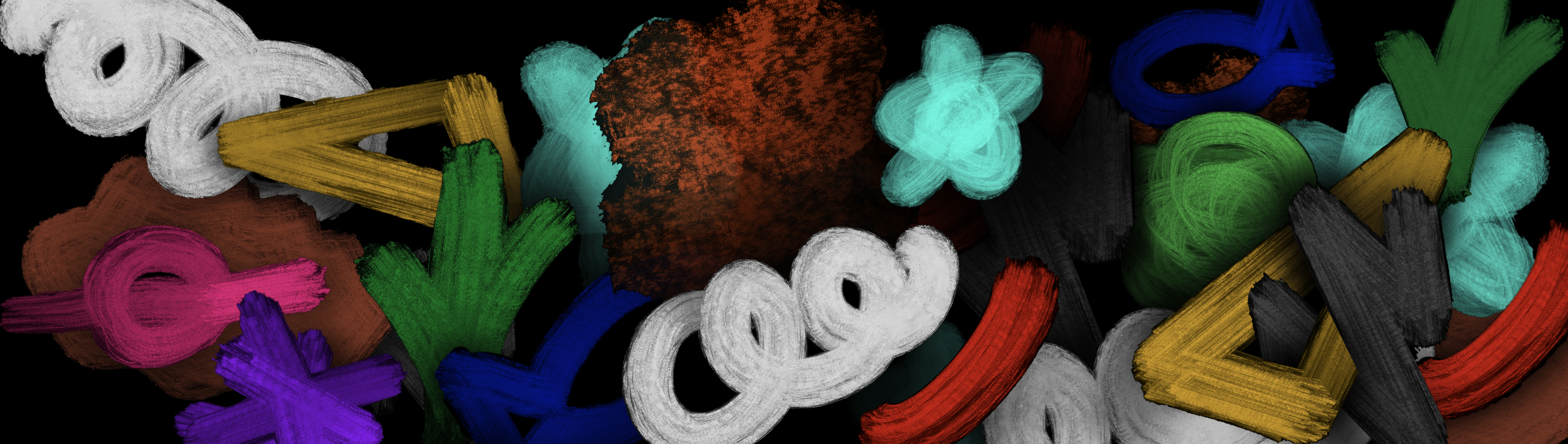
Visualization of the Tastes
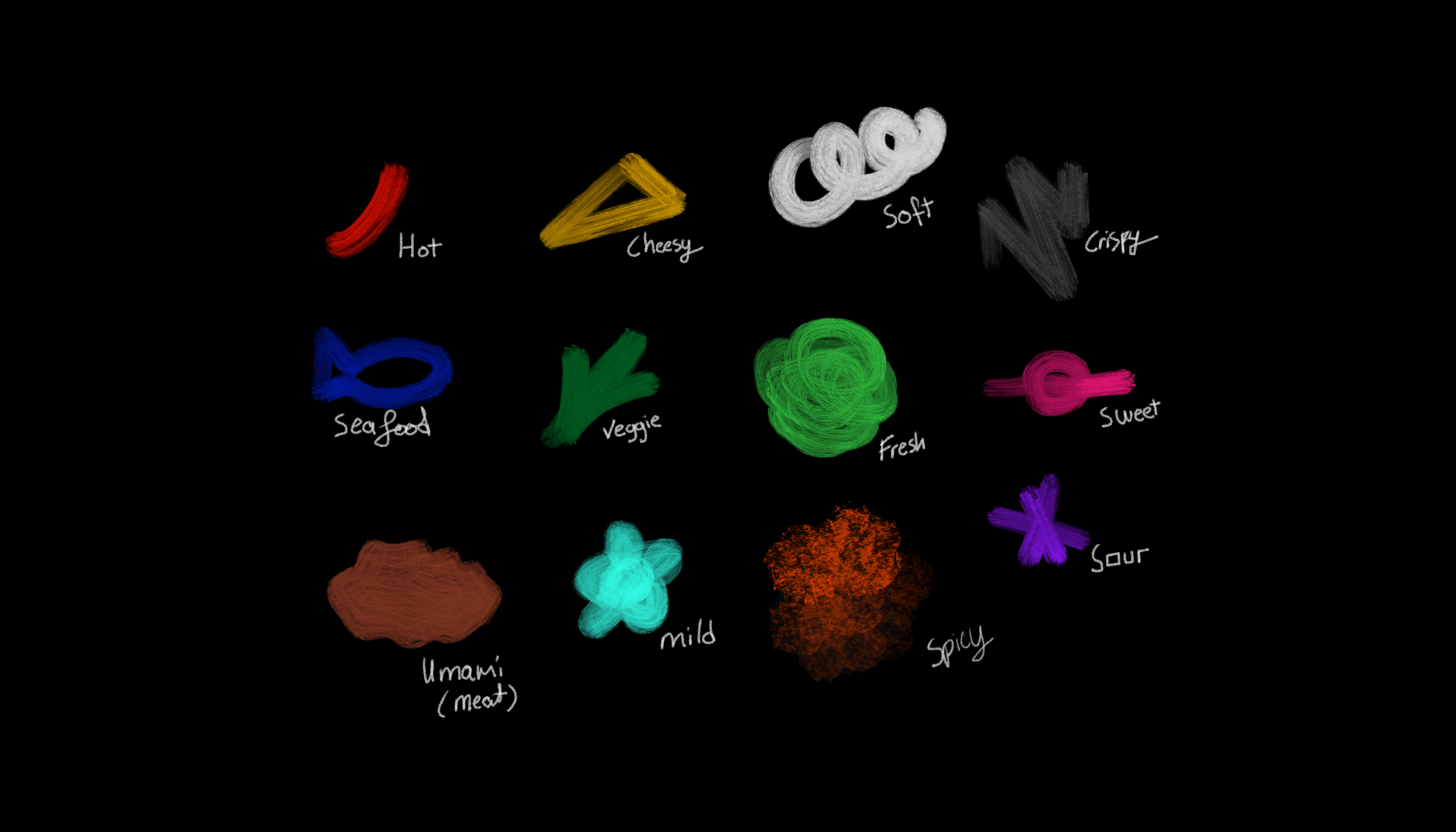
Visualization of the Foods
References
- Tilley, A. (2019) ‘A Visualization Of The Five Primary Taste Sensations,’ Bored Panda, 3 September.
https://www.boredpanda.com/elements-of-tastea-visualisation-of-the-five-primary-taste-sensations - Design Week (2015) ‘Visualising taste,’.
https://www.designweek.co.uk/issues/april-2011-online/visualising-taste/ - Learning About Cities by Mapping Their Smells (2019).
https://www.atlasobscura.com/articles/art-mapping-smell-smellscapes-kate-mclean - Perec, G. (1974). Species of Spaces and Other Pieces. London: Penguin.
- Metahaven (2010). Uncorporate Identity. Zurich: Lars Muller Publishers.
- Berger, J. (1972) Ways of Seeing. London: Penguin.